Project 03
Typography Design
Orange Shift
A typographic system for Roskilde Festival — a display face that bends, blurs and shifts, aligned with the festival’s environmental mission.
The system
A typeface that shifts — like a crowd, like weather, like change.
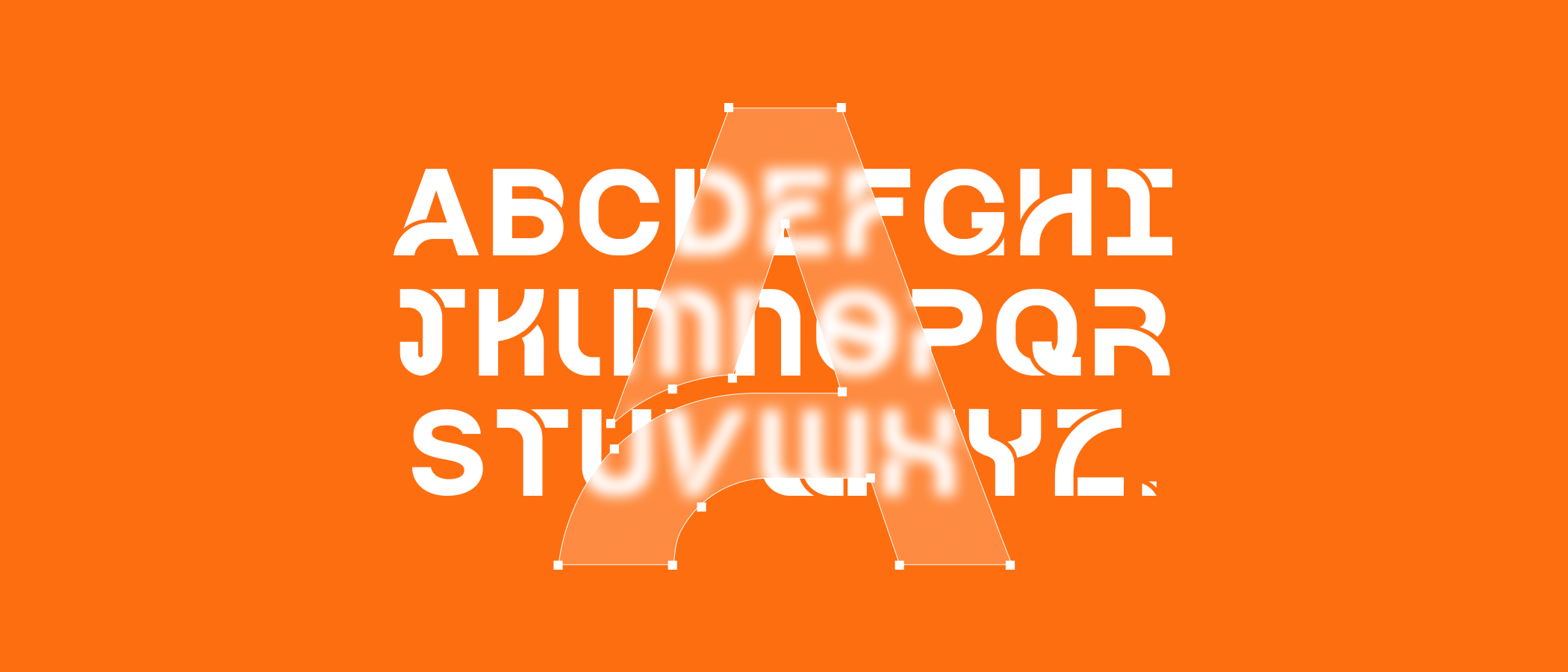
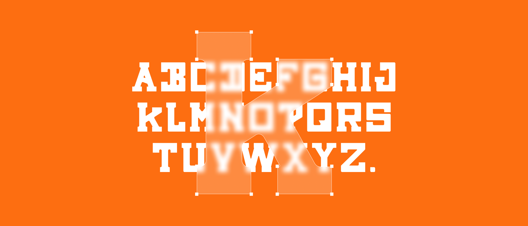
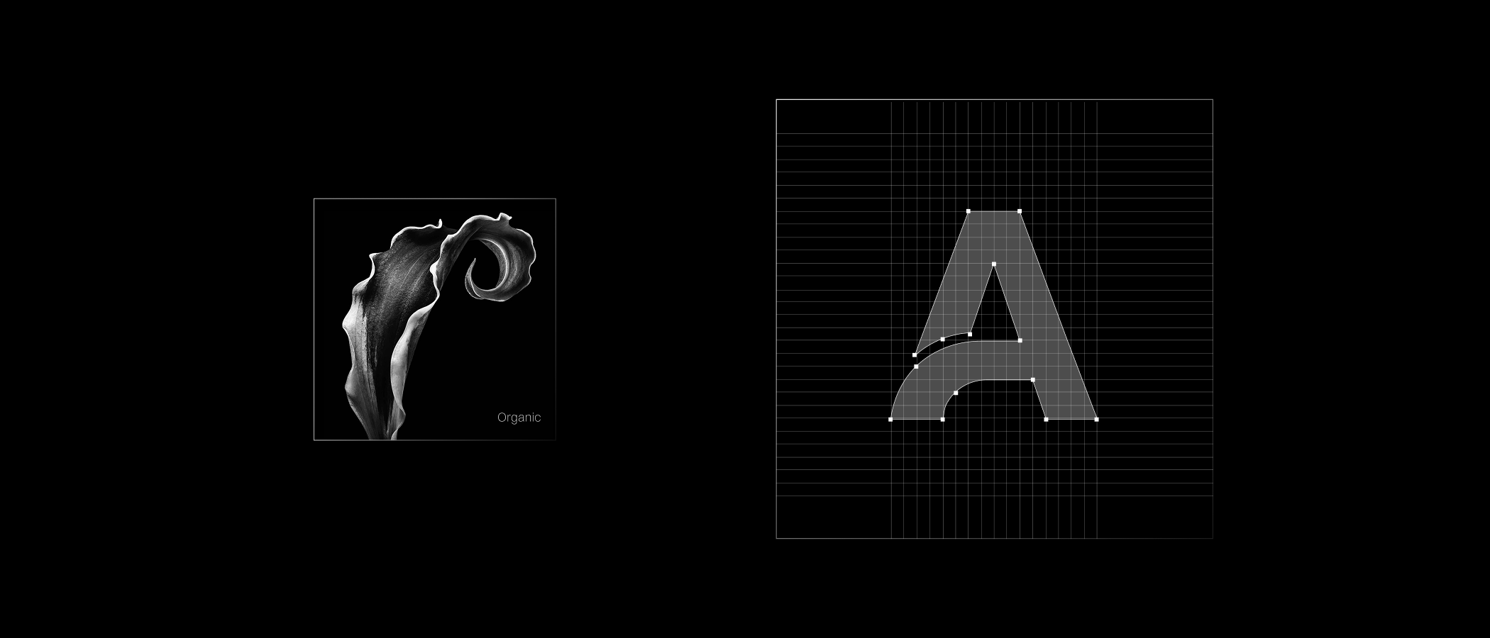
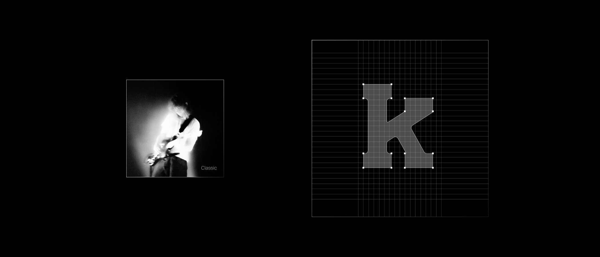
Orange Shift began with a single idea: a letterform that never quite settles. Built on a strict modular grid, each glyph is then distorted, smeared and re-shifted, so the alphabet reads as a system in motion rather than a fixed set of shapes.
The face anchors a full festival identity — posters, schedules and wayfinding — and carries Roskilde’s sustainability message in its very logic: nothing is fixed, everything can change.
Display face — Shift · two cuts
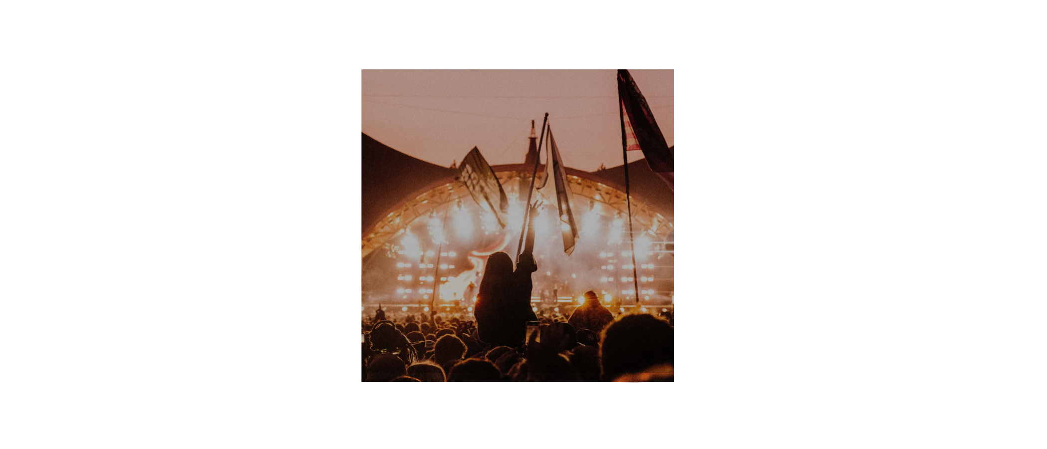
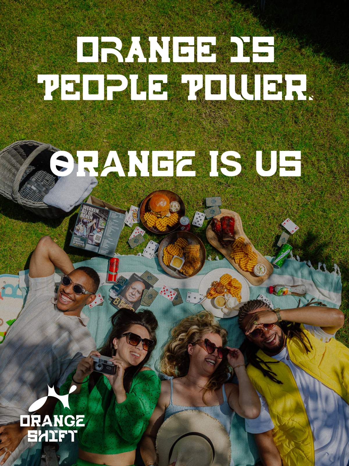
Orange is
people power.
Lockups
One mark, four moods.
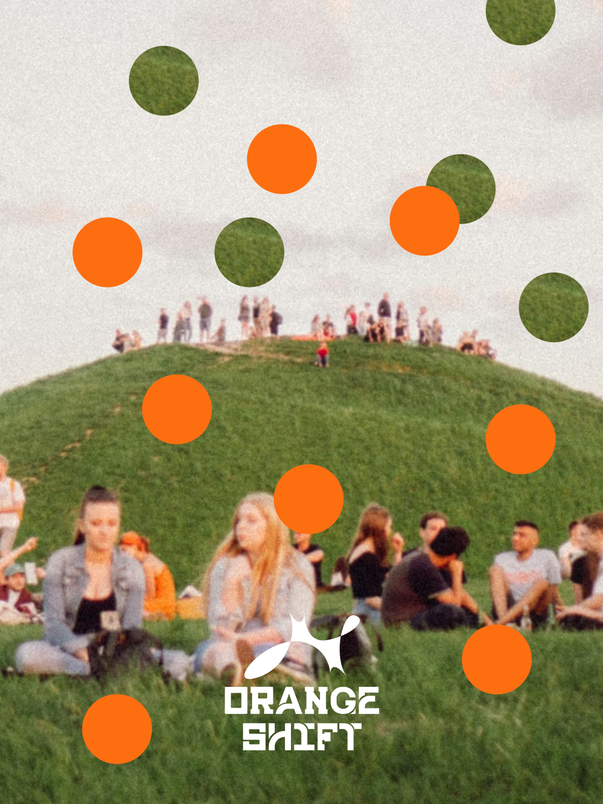
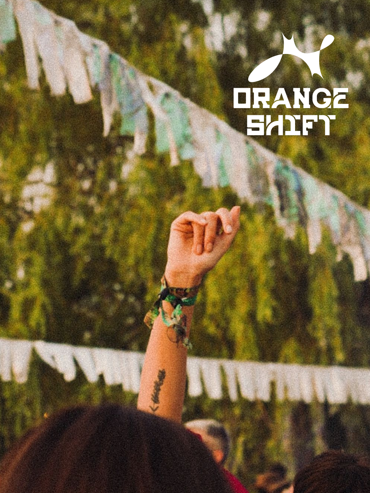
The “Orange Roskilde” lockup flexes across black, orange, mono and photographic backgrounds — proof that an identity can stay recognisable while constantly shifting context.