Project 01
Pattern Design · Branding
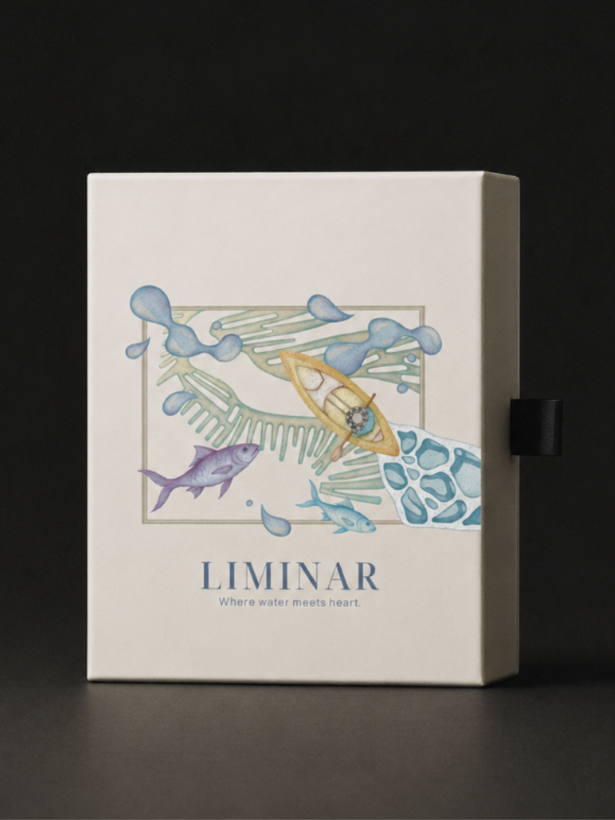
Liminar
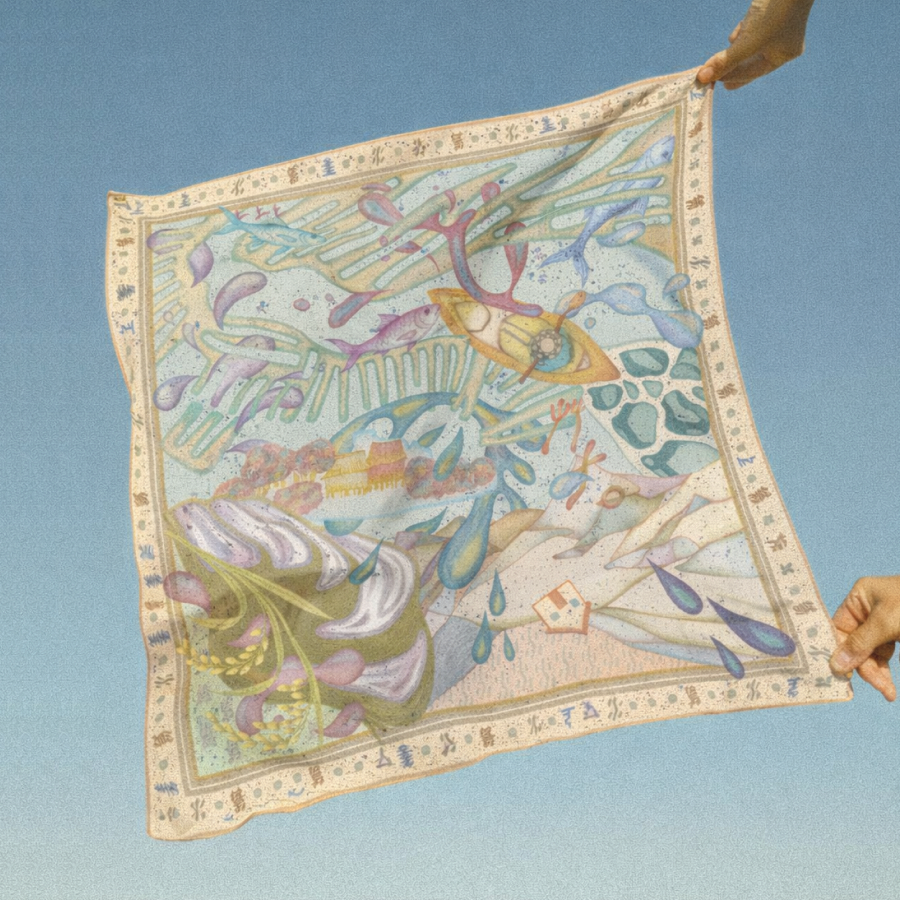
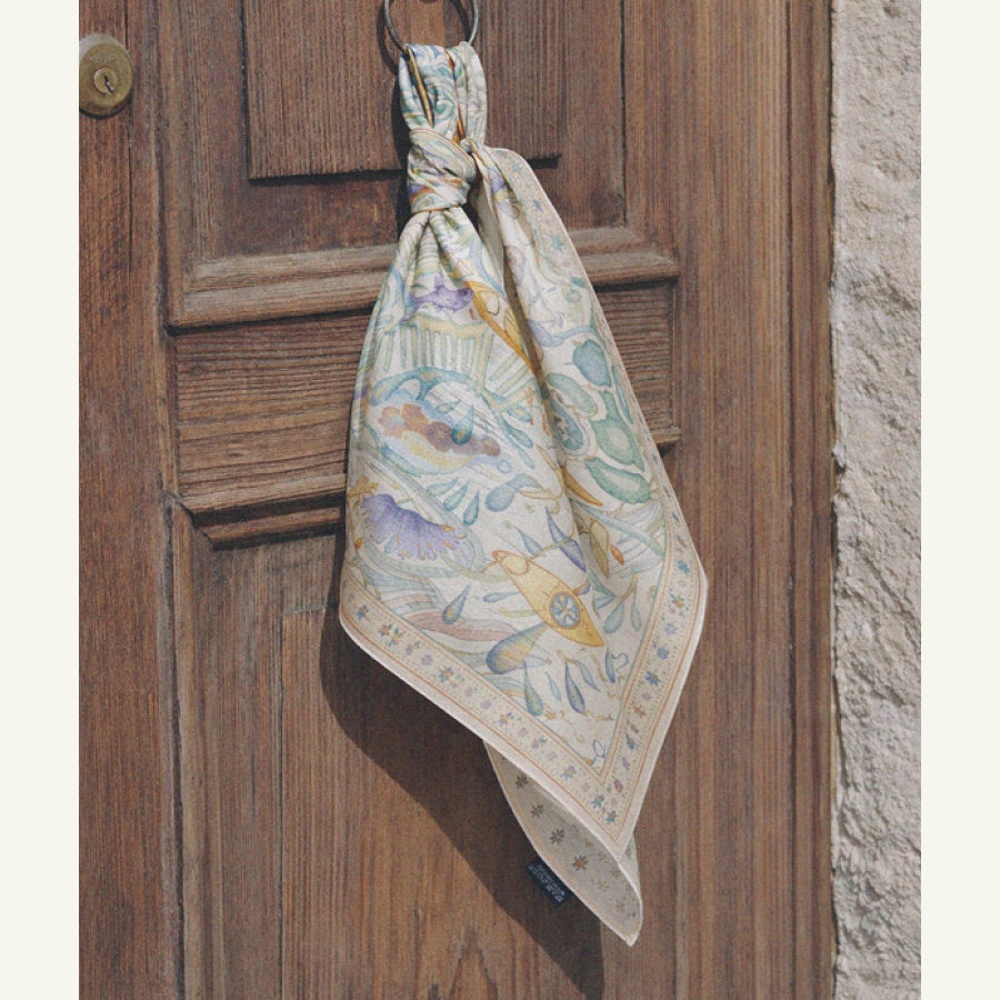
Water as both surface and emotional metaphor — a scarf, a brand, and a meditation on balance, calm and coexistence.
The concept
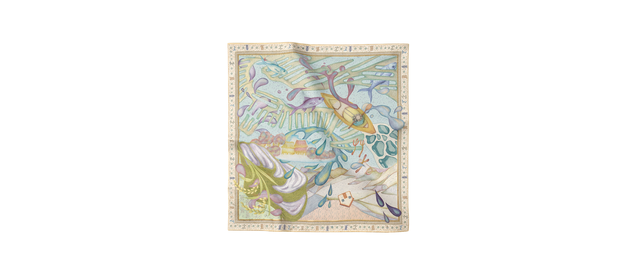
Through collage, memory and culture become an inner terrain.
Liminar takes water as its first principle — fluid, yielding, and quietly powerful. Drawn from the philosophy “the highest virtue is like water,” the project translates a watercolour landscape into a repeatable pattern that lives across silk, paper and skin.
The result is a small brand built on restraint: soft tonal washes, mineral neutrals, and a single recurring motif that shifts meaning as it moves from flat artwork, to folded object, to a landscape worn on the body.
Palette — Mineral neutrals
The highest virtue is like water.
Beauty is the reflection of the heart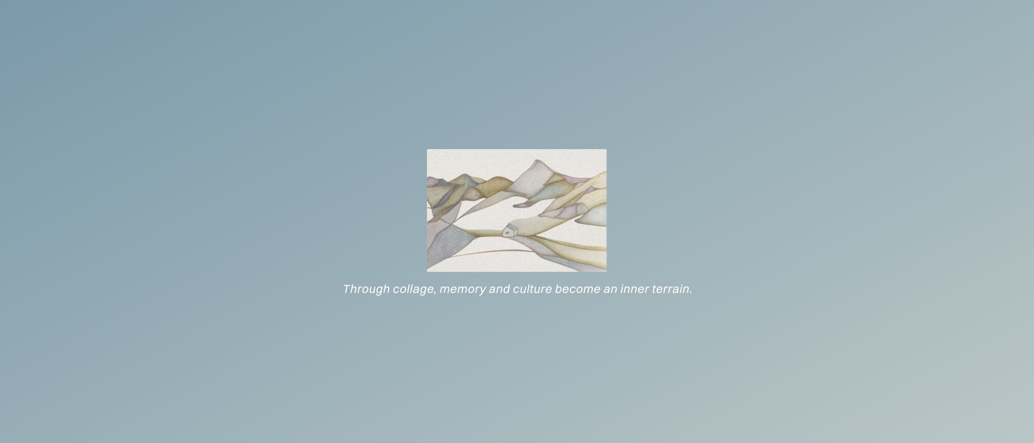
Brand & application
On body, the landscape becomes intimate.
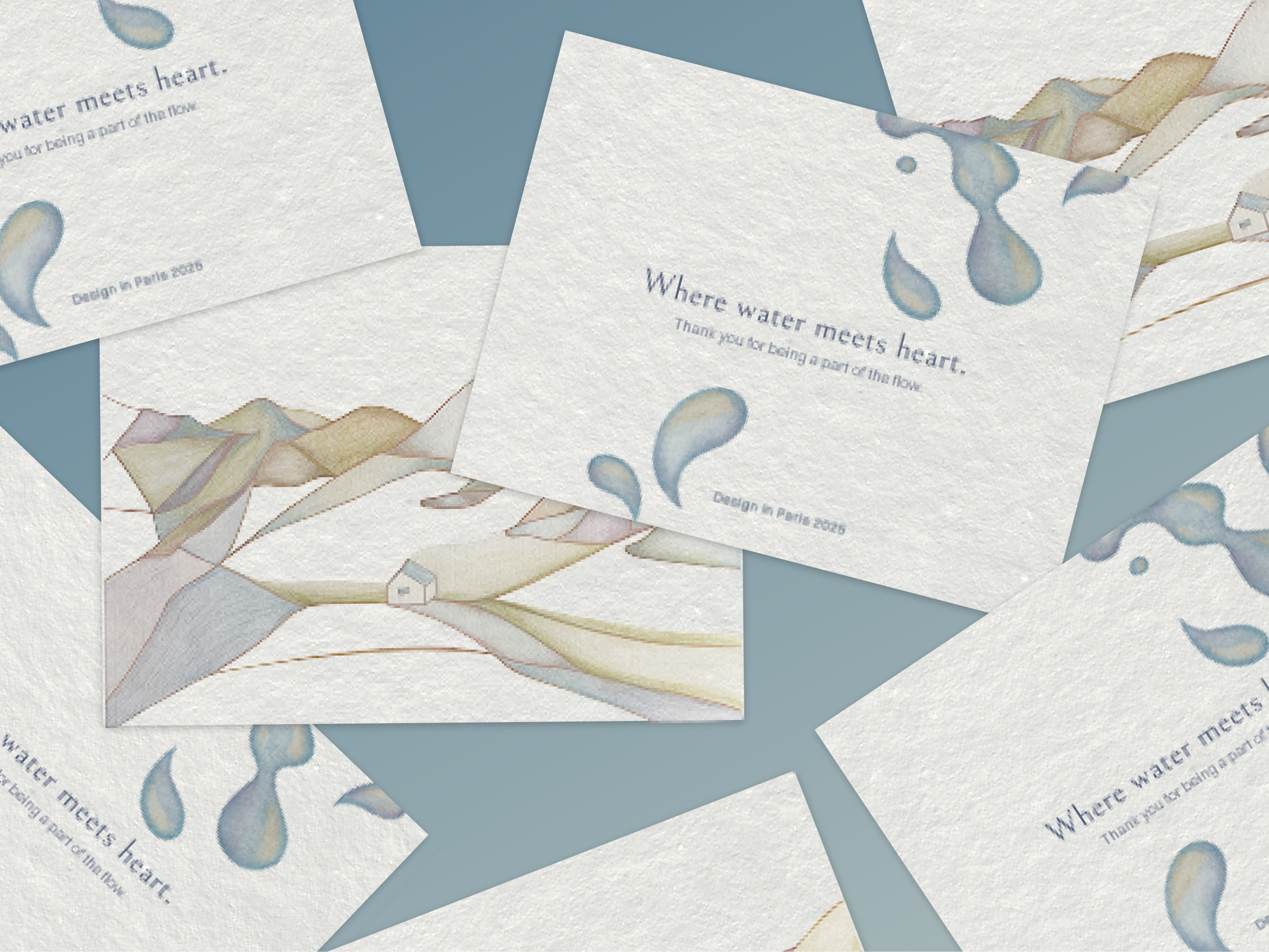
The identity extends the pattern into a complete object — from stationery and business cards to a folding box that opens like a horizon line. Each touchpoint repeats the same gesture: a calm surface, a fold, a reveal.
Typography stays deliberately quiet, letting the watercolour carry the emotion while the system holds everything in balance.