Project 02
Visual System Design
Bitget
A visual language for a global financial platform — built on metal, basalt and a single charge of light, then localized for the Taiwan market.
The system
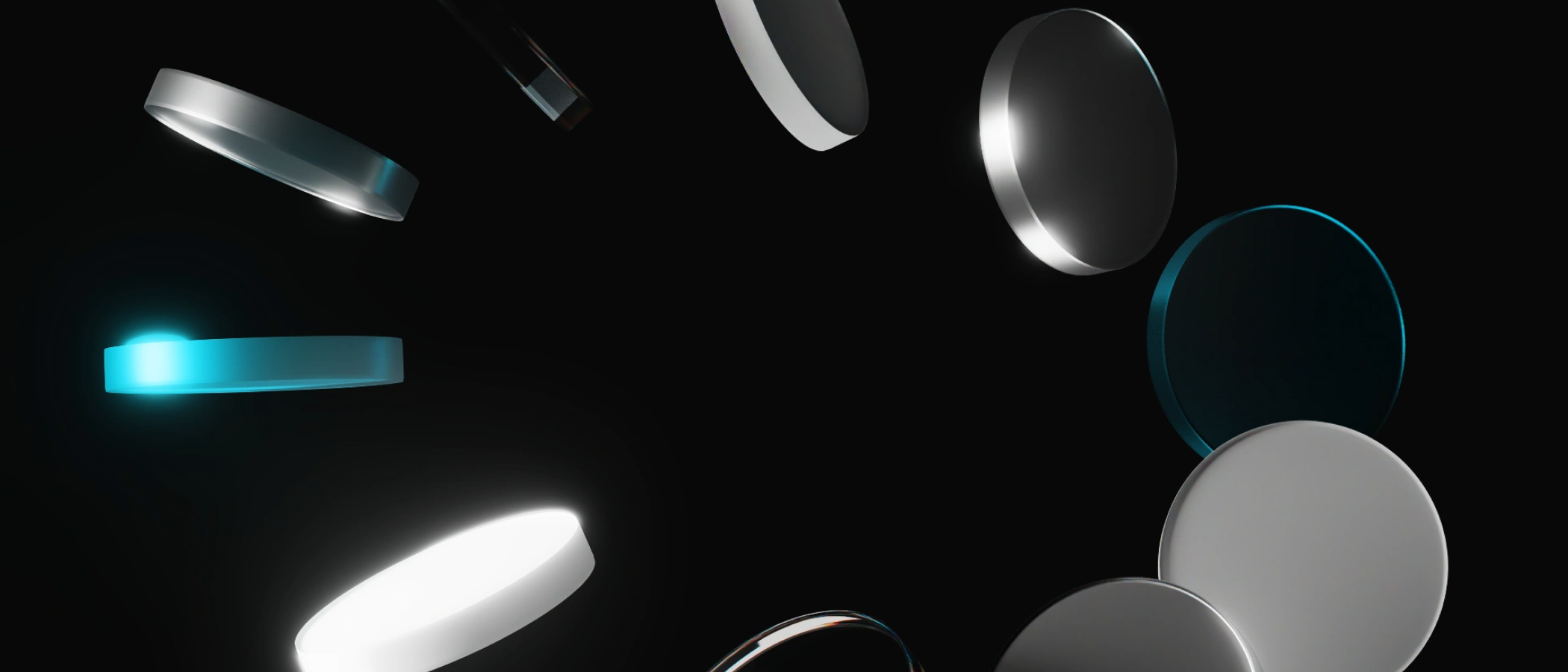
Black, metal, and one charge of light.
Bitget operates across products, campaigns and dozens of markets — so the identity had to be a system, not a set of layouts. The answer was material: a deep basalt black as the ground, brushed and polished metal as the body, and a single electric cyan reserved for the moment that matters.
Every key visual is composed from the same three substances. The restraint is the point — recognisable in a fraction of a second, whether it carries a trading tournament or a seasonal greeting.
Material system — three substances
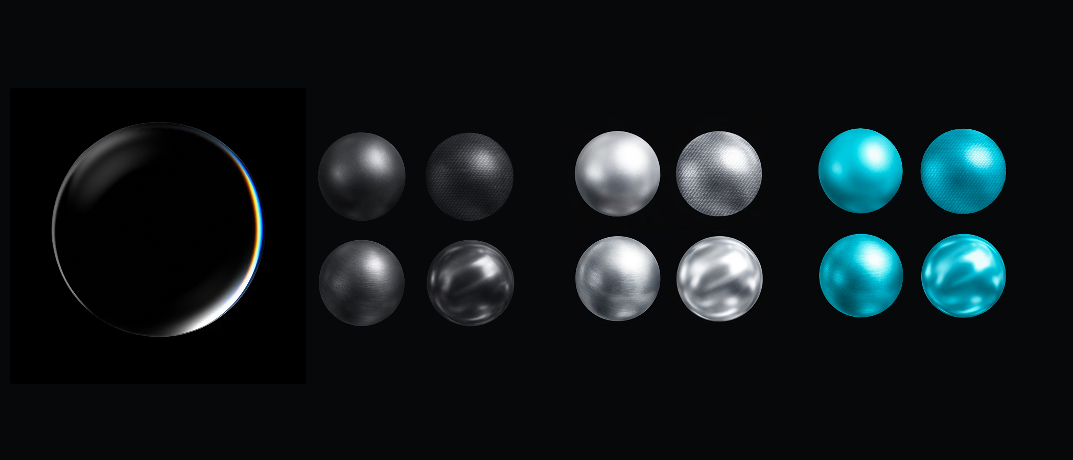
Palette
Object language
Precision, rendered.
Recurring motifs — the target, the radar sweep, the dart on the mark — translate the platform’s core promise into objects you can almost hold. Glass and machined metal, lit once.
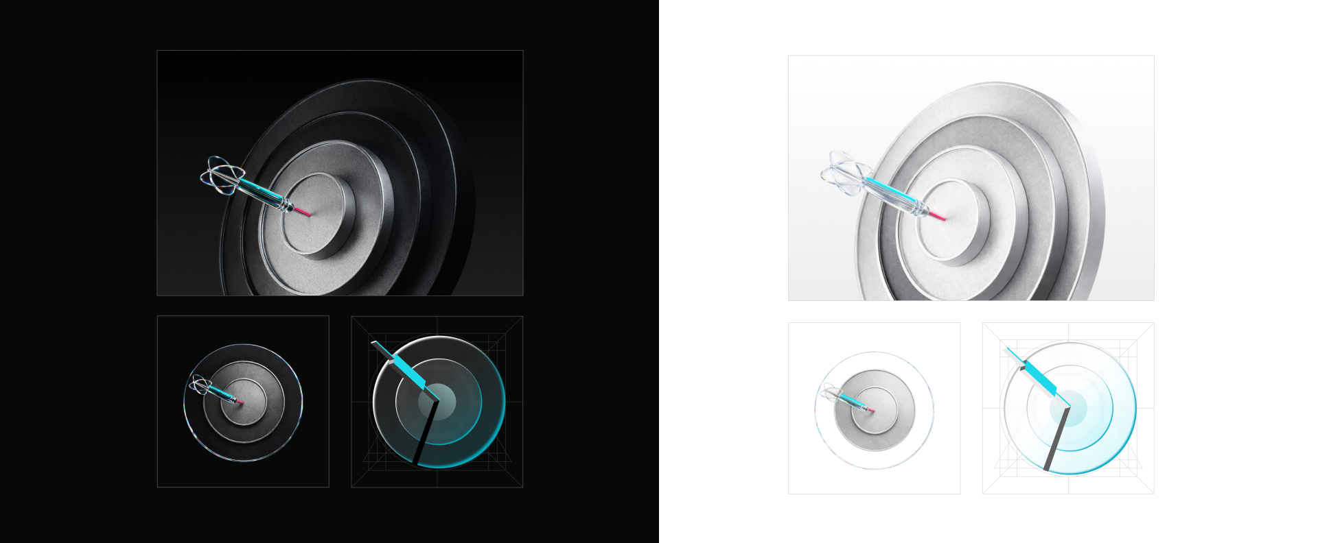
-
L1
Full render
Hero key visuals, campaign covers, web banners, event and stage graphics — anywhere the object is large and has room to breathe. Every material, reflection and chromatic edge fully resolved.
-
L2
Reduced object
Feature cards, product lists, social thumbnails, in-app modules. The object stays recognisable but sheds environment and fine detail so it holds up at mid size beside text.
-
L3
Wireframe symbol
Icons, buttons, loaders and UI micro-elements. Stripped to the core geometry — concentric rings and a single mark — so it reads cleanly at the smallest sizes and can go mono or line-only.
Each level works on either ground: dark is the brand default for digital and night surfaces, where the single charge of light carries; light is for print, partner media and formal contexts — metal turns to polished silver while cyan stays the only colour.
One system,
every market.
Localization — Taiwan · Elements
Tech surface, local soul.
For the Taiwan market the material language meets local symbols — each a piece of everyday culture rebuilt in the brand’s own substances. Four objects anchor the set: the ocean, the mountain, the temple’s sacred moon blocks, and a steamer of soup dumplings.
-
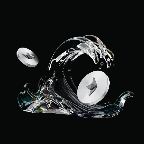
Ocean 海
A glass wave caught mid-crest — the island surrounded by sea, momentum and a rising market in one form.
-
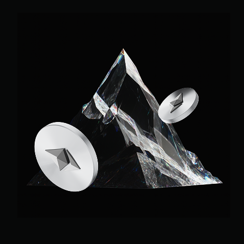
Mountain 山
A cut-crystal peak for the high ranges that run the island’s spine — solidity, the long climb, the summit.
-

Moon blocks 筊杯
The temple’s divination blocks — a wink at fortune and the call of the market, deeply familiar locally.
-
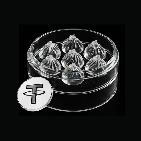
Dumplings 小籠包
A steamer of xiaolongbao rendered in glass — the most-loved taste of Taiwan, paired with USDT.
One construction rule holds every motif together: the cultural object is always glass, the coin always metal, lit once on basalt. Culture reads as part of the system — not a sticker on top of it.
Application — social feed
From system to feed.
In market the same parts assemble into live promotions. Each post keeps the rules — basalt ground, one rendered hero, cyan held for the single live accent, Traditional Chinese set in a strong sans so the offer lands in a scroll.
-
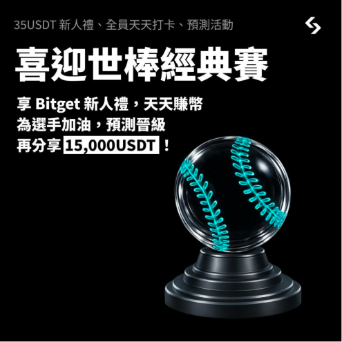 EventWorld Baseball Classic — predict & share 15,000 USDT
 -
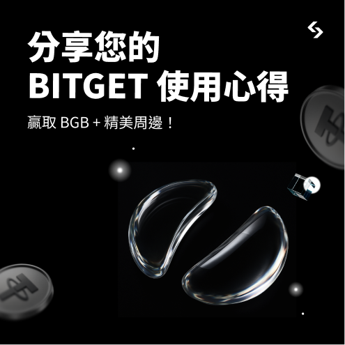 CommunityShare your Bitget review — win BGB & merch
 -
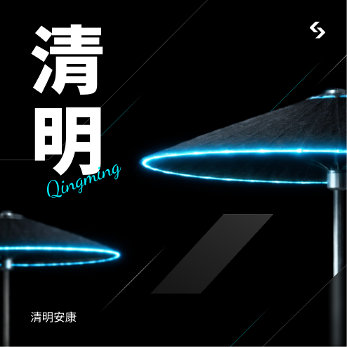 GreetingQingming 清明 — a seasonal note to the community
Campaign series
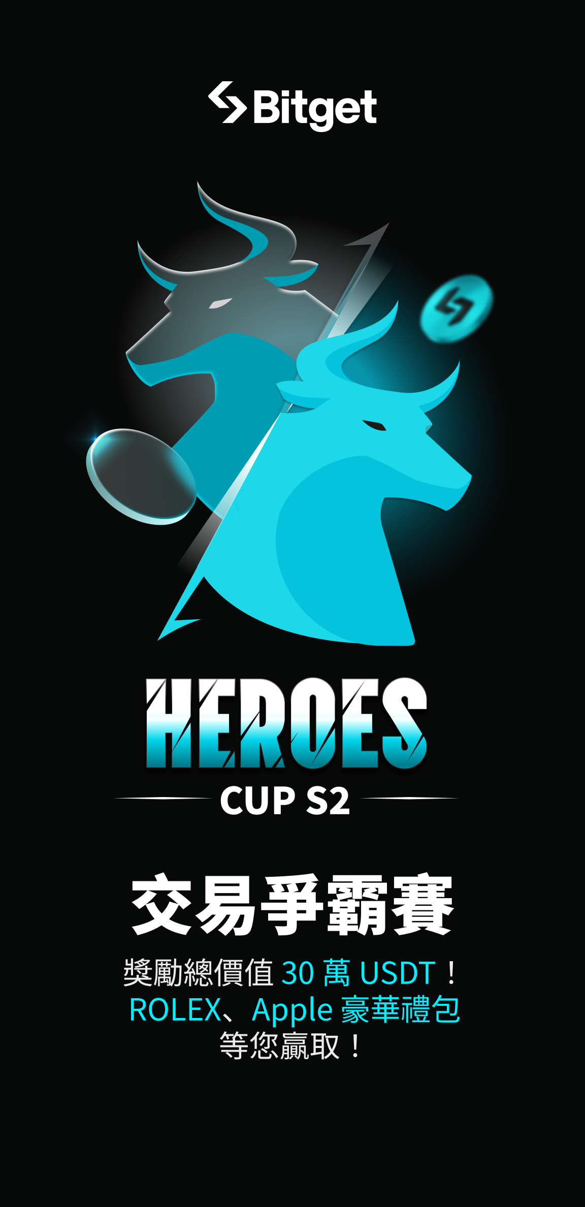
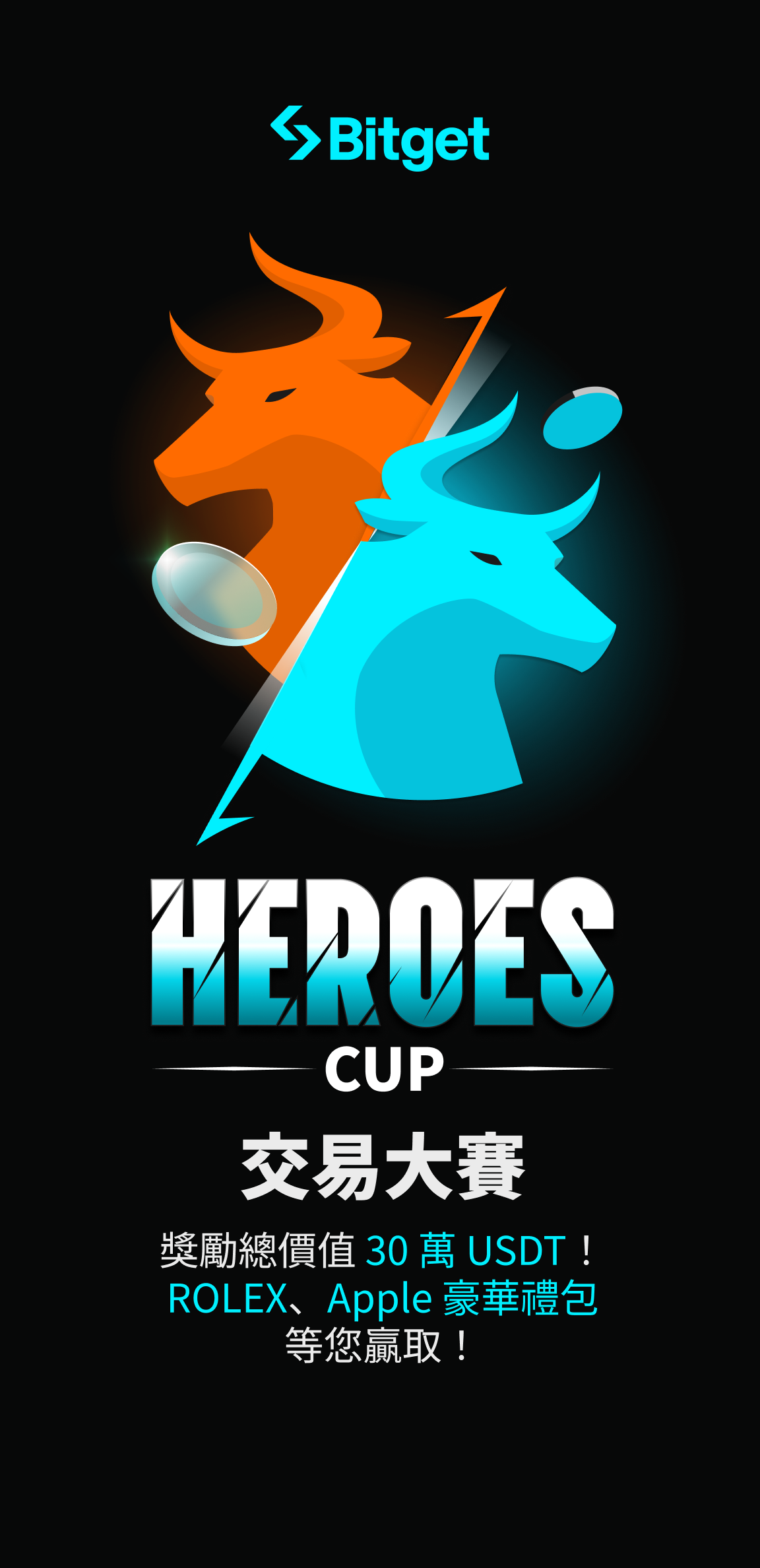
Heroes Cup — four seasons of one idea.
The same tournament, four seasons running. Each key visual was redrawn from the ground up — flat heraldic mascots giving way to fully rendered glass bulls — yet the rules never moved: basalt ground, one charge of cyan, the wordmark locked. The result reads as one escalating story rather than four separate posters.
-
S1Season 01
Two-colour duel
Flat vector mascots — orange against cyan — set the rivalry. Emblem-led, logo forward, the system in its boldest, simplest form.
-
S2Season 02
One brand colour
Orange retires. A single cyan champion steps forward with the rival ghosted behind — gradients and depth replacing flat fill.
-
S3Season 03
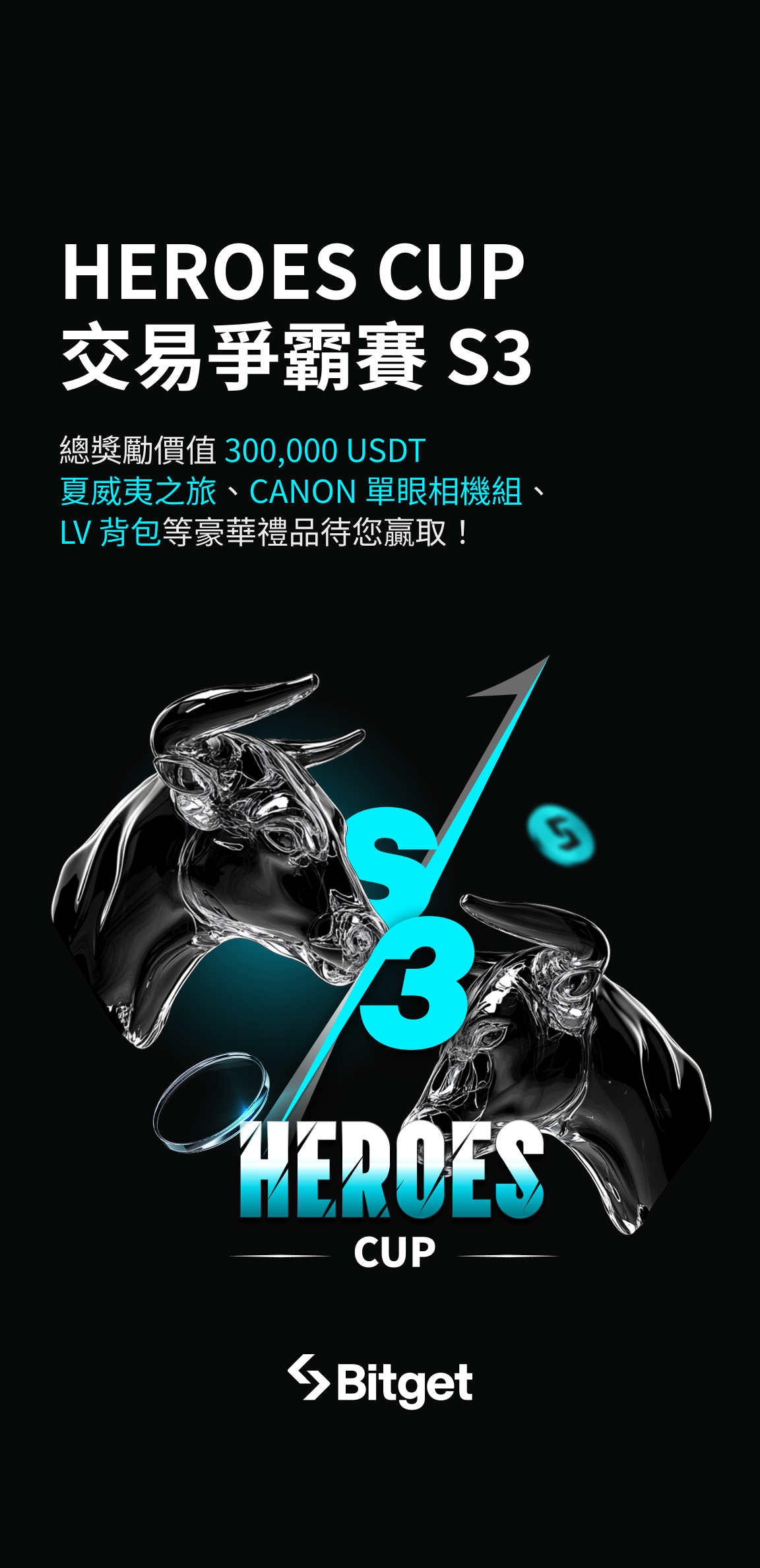
Into three dimensions
The leap to rendered glass. Black-on-black sculpture, cyan as the only charge, and the season number woven into the art.
-
S4Season 04
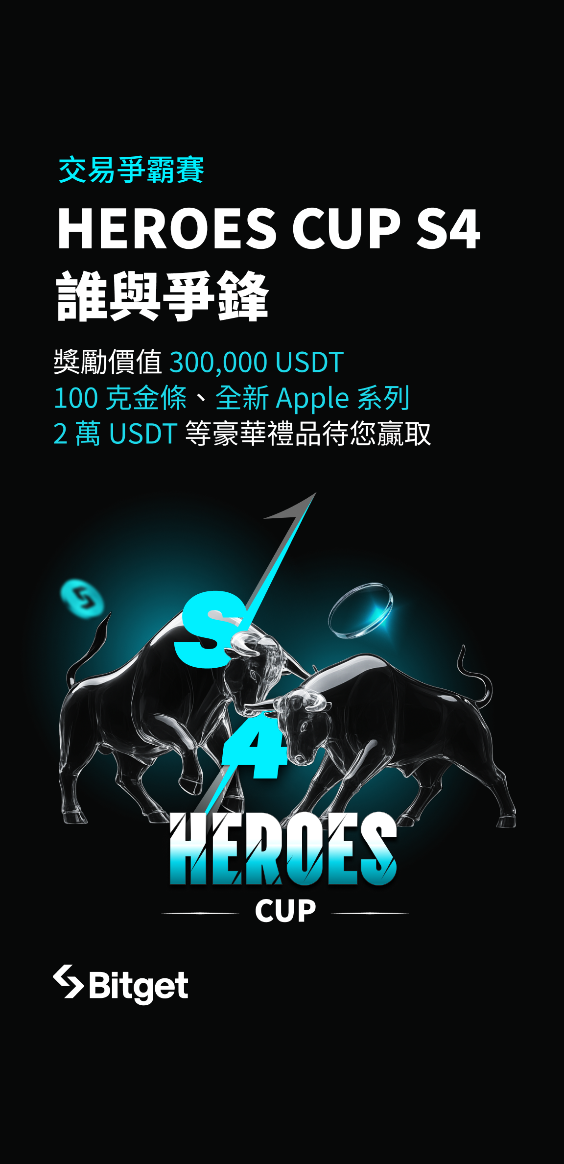
Full clash, cinematic
Two full-body glass bulls collide. Headline-led and editorial — the duel from S1 returns, now rendered at full force.
Across every season the constants do the work: basalt ground, a single cyan accent, and the locked Heroes Cup wordmark. Everything else — dimensionality, cast, composition — is free to escalate, which is what lets four years of artwork still read as one campaign.